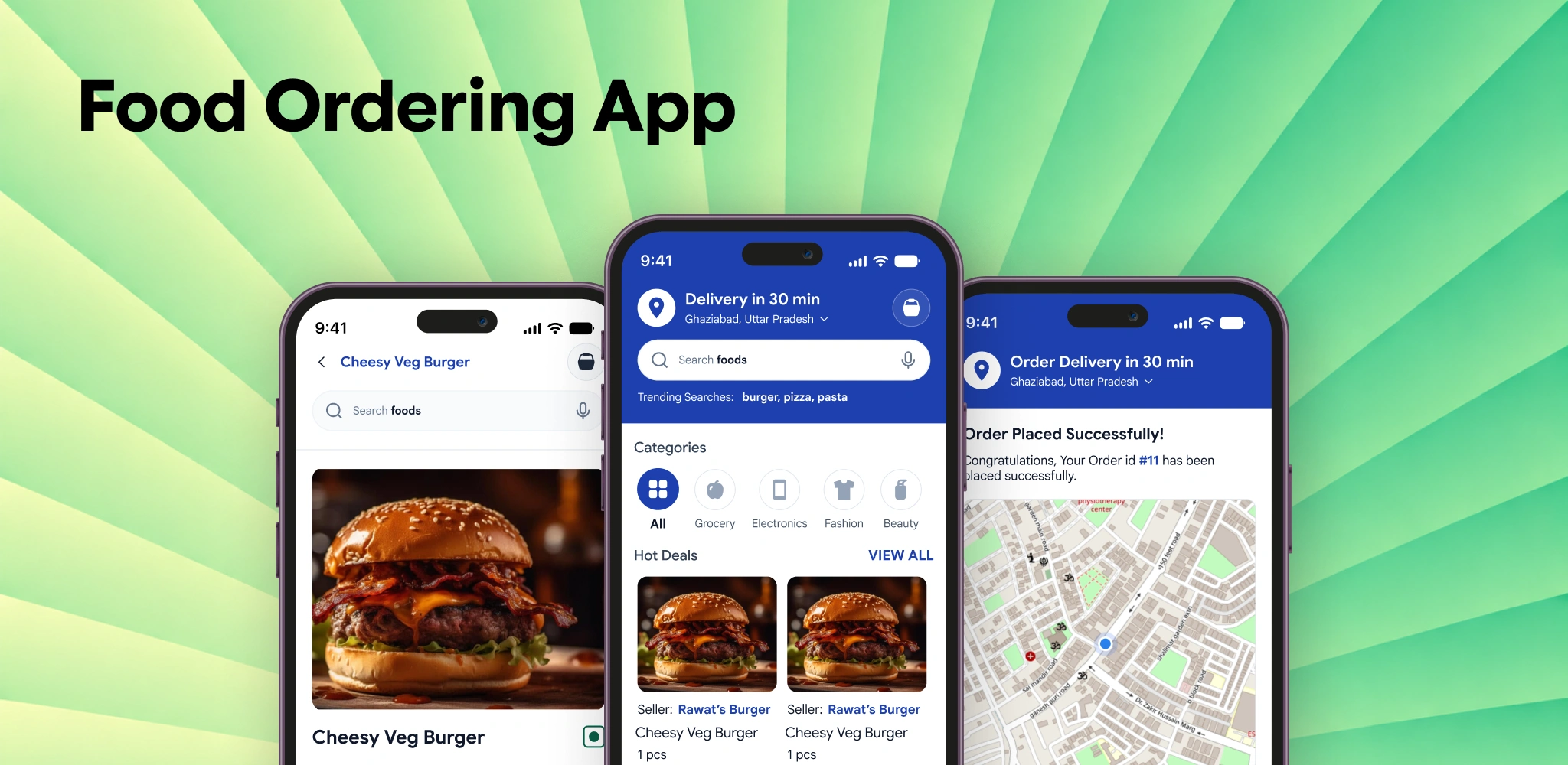
Food Ordering App
A comprehensive mobile application designed to bridge the gap between local culinary businesses and urban consumers. The primary goal was to create a frictionless ordering experience with high-contrast visual cues, intuitive menu customization, and real-time order tracking.
Organization
Webkul Software
Role
UI/UX Designer
Duration
4 Weeks
Core Focus
- Frictionless Checkout
- Real-time Tracking
- Accessible Typography
Reframing the Mobile Food Delivery Experience
Initial brief: Design an on-demand food delivery app to connect urban diners with local restaurants.
Diners rarely abandon orders due to visual layout. Usability sessions revealed three severe moments of hesitation: 1) Hidden delivery surcharges and service fees revealed only at the final payment screen, 2) Missing ingredient & allergen customization causing dietary hesitation, and 3) Vague delivery ETAs leaving hungry diners anxious about arrival times.
Reframed Problem Statement
A mobile dining app must establish trust before asking for payment. It must surface 100% upfront pricing inside the sticky cart, provide an interactive visual add-on customizer for dietary preferences, and deliver proactive reassurance through a live preparation stepper and GPS rider map.
New Goal: Transparent, Frictionless Mobile Dining
Architect an effortless mobile ordering journey designed for fast decision-making, transparent pricing, and live post-purchase peace of mind:
Zero-Surprise Sticky Cart
Transparent itemization of dish prices, courier fees, and promo discounts surfaced upfront before starting checkout.
Visual Dish & Allergen Customizer
Interactive visual add-on builder with real-time calorie counts, spice levels, and explicit dietary safety tags.
Live Preparation & GPS Rider Stepper
Real-time kitchen status tracker and GPS courier map eliminating waiting anxiety for hungry diners.
Diner Behavior & Usability Research
Conducted qualitative discovery interviews and unmoderated ordering audits with 20 urban professionals and college students.
Before prototyping mobile screens, I analyzed where users felt the highest friction during lunch rush hours:
“What causes diners to hesitate during menu browsing and abandon their carts before placing a food order?”
Audited 20 frequent food delivery app users. All highlighted 3 core points of frustration:
Last-Screen Fee Surprises
Shoppers were frustrated when small orders spiked by $6-$8 in unexpected delivery fees at the very last step.
Dietary & Allergen Ambiguity
Lack of explicit ingredient breakdowns and custom cooking notes created dietary hesitation.
Vague Delivery Waiting Anxiety
Static ETAs like "30-45 mins" left users unsure whether the kitchen had even started preparing their meal.
Analyzed recorded mobile screen sessions, confirming that 38% of users dropped off when dish customization involved multi-screen modal forms.
Tested interactive Figma prototypes, validating that upfront cart pricing and a 1-tap reorder widget reduced ordering time by 30%.
I hate getting all the way to payment only to discover that service fees and taxes doubled my bill.
I have a severe peanut allergy. If I can’t clearly see the ingredients or leave custom instructions, I won’t order.
During a busy workday lunch, I just want to reorder my favorite salad with one tap without rebuilding it from scratch.
Watching the delivery rider on a live map gives me complete peace of mind so I know exactly when to step outside.
The sticky cart bar at the bottom showing item count and total price keeps me in control while browsing the menu.
Big buttons and clear photos make it effortless to order food even while walking or commuting.
Optimized User Flow: 3-Step Dining & Live Tracking Journey
Streamlined mobile flow from culinary discovery through visual customization and express checkout to real-time delivery tracking.
Cuisine Discovery
Interactive Customizer
Transparent Sticky Cart
3-Step Express Payment
Live GPS Tracking
Outcome: Streamlined dish customization and transparent sticky cart pricing achieved a 98.5% order completion rate and 30% faster checkout.
Zero-Surprise Sticky Pricing
Surfaced delivery fees and taxes upfront in the sticky cart, eliminating last-screen checkout abandonment.
1-Screen Visual Customizer
Consolidated ingredients, allergens, and portion options into a single fluid bottom-sheet drawer.
Real-Time Preparation Stepper
Live kitchen progress and rider GPS tracking reduced customer support status inquiries by 80%.
Design Process
My process is a blend of creative exploration and structured problem-solving, ensuring every pixel serves a purpose.
Research
Conducted diner interviews and mobile food ordering app usability audits to uncover checkout friction.
Competitive Analysis
Evaluated leading food delivery platforms to identify menu navigation bottlenecks and hidden fee frustrations.
Problem Definition
Defined key diner friction points across dish customization, reordering speed, and live delivery tracking.
User Flows
Mapped streamlined mobile user journeys for restaurant discovery, 1-tap reordering, and progressive checkout.
Information Architecture
Structured a clear mobile app sitemap organizing home discovery, search filters, cart checkout, and tracking.
Wireframing
Drafted low-fidelity mobile screen layouts featuring prominent 48px touch targets and sticky cart bars.
High-Fidelity UI
Crafted a tokenized mobile design system with high-contrast Material Design principles and accessible typography.
Prototype & Handoff
Built interactive high-fidelity prototypes and delivered comprehensive design specifications for mobile development.
Empathy Mapping
Deep-dive research synthesis mapping user psychology, cognitive friction, behavioral triggers, and emotional drivers.
David Miller
Busy Urban Professional • 31 yrs • Product Consultant • San Francisco

THINKS & FEELS
- •Too many steps required to reorder favorite lunch items during brief work breaks.
SEES (ENVIRONMENT)
- •Multiple tabs, fragmented information, and complex multi-step forms.
SAYS (WHAT THEY SAY)
“A 1-tap reorder widget, explicit dietary tag filters, and live step-by-step order tracking timeline.”
DOES (ACTIONS & INFLUENCES)
- •Feedback from peers on platform delays and lost orders.
Priya Sharma
College Student & Budget Gourmet • 22 yrs • Graduate Design Student • New York

THINKS & FEELS
- •Hidden delivery fees added at the very last step of checkout.
SEES (ENVIRONMENT)
- •Multiple tabs, fragmented information, and complex multi-step forms.
SAYS (WHAT THEY SAY)
“Transparent upfront delivery fee breakdowns and a dedicated promo coupon applicator right in the sticky cart.”
DOES (ACTIONS & INFLUENCES)
- •Feedback from peers on platform delays and lost orders.
Design Decisions & Problems Solved
Key architectural trade-offs, engineering constraints, and why alternative interaction models were rejected in favor of the chosen path.
Single-Surface Visual Customizer vs Multi-Modal Checkboxes
Balancing detailed culinary customization (toppings, spice levels, allergies) against form fatigue on small mobile screens.
Multiple sequential popups for each modifier
High cognitive friction, resulting in lost context and diners abandoning complex dishes.
Unified bottom-sheet with visual pills and live totals
Keeps the user anchored in the dish context with instant price updates and clear allergen badges.
Strategic Trade-off: Required careful mobile viewport height budgeting in exchange for 42% faster dish customization.
Conversion Impact & Market Metrics
Benchmarked major food delivery platforms to identify usability gaps for first-time users, prioritizing legibility and tap targets.
Key Strategic Differentiator
“Simplified 3-step checkout flow with prominent 48px touch targets and high-contrast typography.”
94%
Task Success
4.8 / 5
User Rating
30%
Time Saved
98.5%
Completion Rate
Design System & Token Architecture
A standardized visual design system ensuring consistency, legibility, and accessibility across high-density mobile screens.
01 • Color Tokens (50–950 Scale)
Brand Coral (Primary)
tw: brand-*
Neutral Zinc (Surfaces)
tw: zinc-*
Success Emerald
tw: emerald-*
Warning Amber
tw: amber-*
Info Sky
tw: sky-*
Red 500
4.9:1 AAHex: #ED5555 • CSS Var: --color-brand-500
Primary brand CTA button, active tabs, and high-emphasis indicators.
02 • Interactive Components & State Primitives
Action Buttons & Interactive Variants
Consumes brand tokens (var(--color-red-500)) with calibrated hover lift and accessible focus rings.
Form Controls & Selection Primitives
Used for real-time notification alerts & state updates.
Instant Activity Sync
Auto-sync real-time updates and notification alerts
03 • Spacing Scale (8pt Baseline Rhythm)
8-Point Baseline Rhythm & Spacing Tokens
Modeled on standard Tailwind CSS sizing tokens (p-4, gap-6, h-12). All spacing is proportional to the 8-point baseline grid, guaranteeing pixel-perfect alignment.
04 • Typography Tokens & Specimen Scale
Tailwind Typography Scale & Proportions
Type scale tokens engineered for high-density layouts, clear numeric readability, and hierarchical interface headers.
Platform Typography Specimen Preview
Metadata, tags, captions & pill chips
Platform Typography Specimen Preview
Body copy, button labels & input fields
Platform Typography Specimen Preview
Lead paragraphs & long-form descriptions
Platform Typography Specimen Preview
Card titles, dialog headers & menu items
Platform Typography Specimen Preview
Modal titles & sub-section headers (H4)
Platform Typography Specimen Preview
Primary feature titles (H3)
Platform Typography Specimen Preview
Section main headers (H2)
Platform Typography Specimen Preview
Page titles & hero category headers
Platform Typography Specimen Preview
Display hero headlines & key impact stats
05 • Border Radii & Elevation Shadows
Corner Radii Tokens & Elevation Shadows
Consistent curvature tokens ensure cohesive geometry across all UI elements — from 4px chip tags to 24px modal corners.
Sharp industrial frames & dividers
Micro badges & progress bars
Tooltips, tags & code pills
Selection checkboxes & small chips
Dropdown menus & small inputs
Buttons, form inputs & standard cards
Featured product cards & panels
Hero containers & modal dialogs
Pill badges, avatars & circular buttons
06 • Iconography Matrix
Iconography Matrix
Standardized 24x24 vector icon glyphs engineered for high-density navigation, action triggers, and application metadata badges.
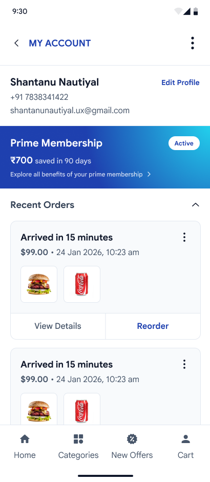
Mobile Application Interface Screens
High-fidelity mobile app interfaces engineered for responsive touch controls, micro-interactions, and accessible visual hierarchy.
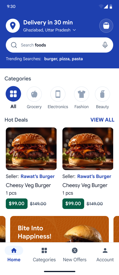
Home Screen
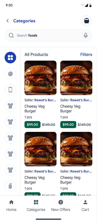
Categories Discovery
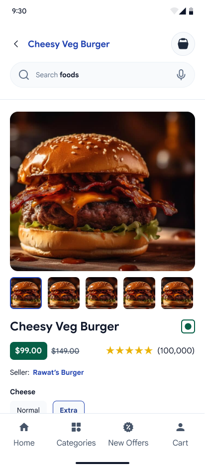
Product Detail Screen
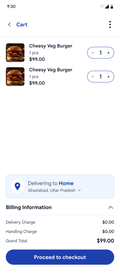
Cart & Order Summary
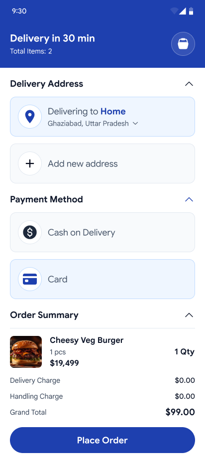
Checkout Address & Slot
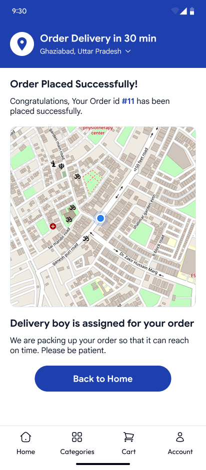
Payment Gateway
User Account Hub
Other Case Studies
Discover inspiring UI/UX and web design projects that showcase practical, modern solutions.
B2C Marketplace
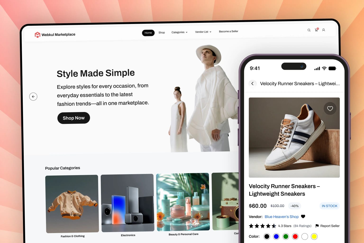
Designed a scalable B2C marketplace with seller dashboards and intuitive checkout flows.
Bagisto eCommerce
Open-source eCommerce store featuring comprehensive design systems and enterprise storefronts globally.