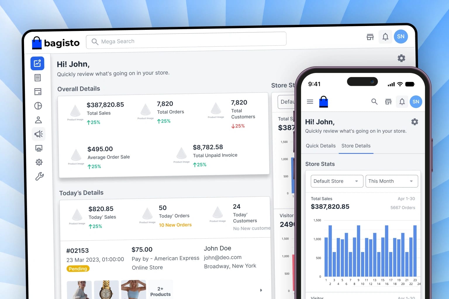
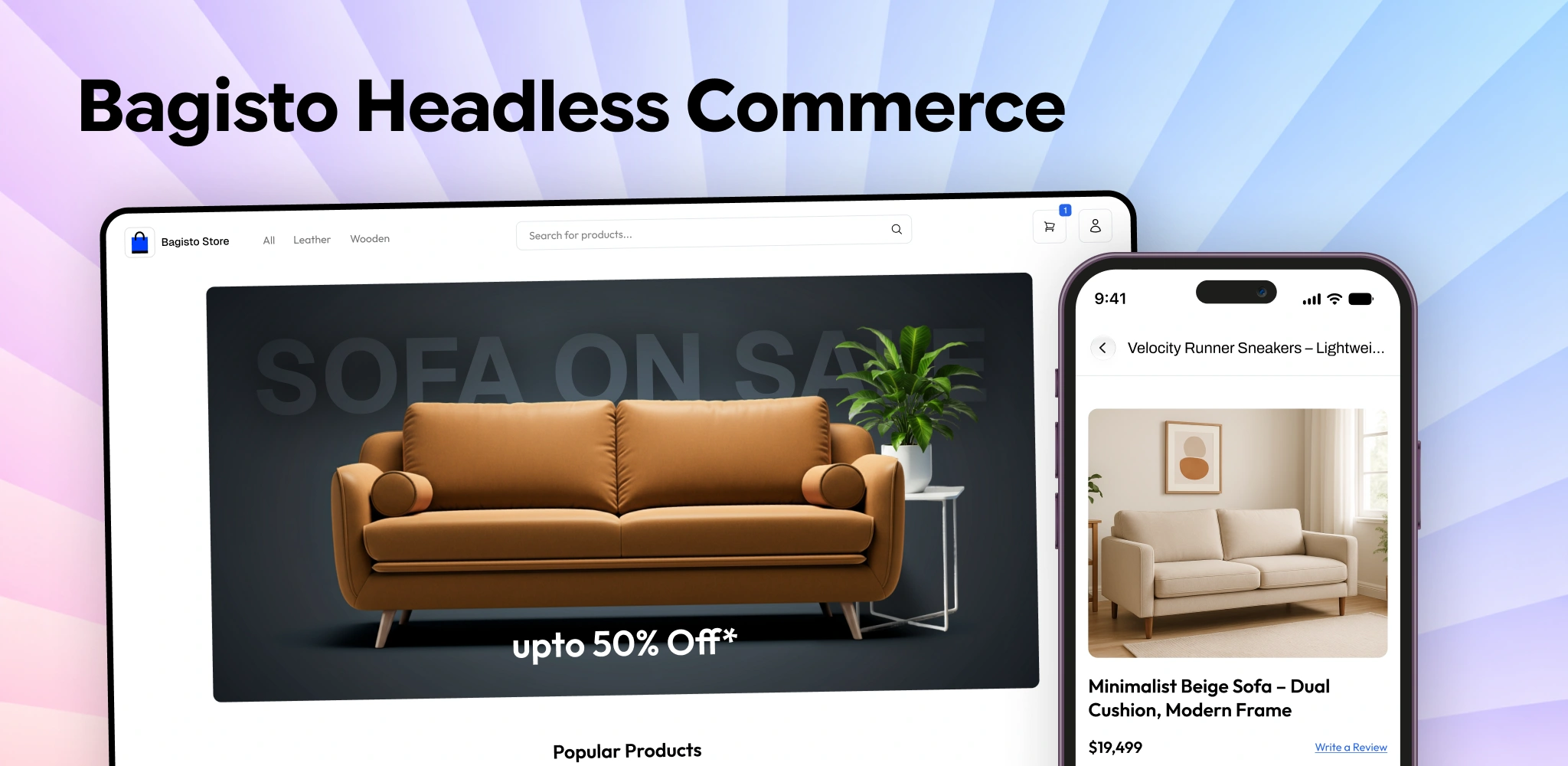
Bagisto Headless Commerce
A modern, customer-centric eCommerce storefront designed for seamless product discovery, intuitive side-by-side comparison, a frictionless 4-step progressive checkout flow, and a centralized customer account workspace.
Organization
Webkul Software
Role
Product Designer
Duration
Aug 2025 – Nov 2025
Core Focus
- Product Discovery UX
- Frictionless Express Checkout
- Centralized Customer Dashboard
- Design System Architecture
I Reframed the Problem
What I was asked to solve: Streamline the user journey and remove checkout/onboarding drop-offs.
The initial friction wasn't just a UI surface issue. It was covering for 3 critical breakdowns: unclear decision pathways, anxiety around pending actions, and fragmented steps. Simply removing screens without fixing flow transparency would have traded one bottleneck for a broken funnel.
Reframed Problem Statement
Fixing the experience means the end-to-end flow has to do the heavy lifting for the user. Right now it can't. It doesn't break down costs/timeline upfront, doesn't provide real-time reassurance, and requires too many manual verification steps.
New Goal
Build a modern, self-serve flow that eliminates friction points through proactive transparency and automated workflows. This included:
Frictionless Architecture
Eliminating redundant confirmation screens and unifying multi-step workflows into intuitive self-serve paths.
Transparent Feedback
Providing instant status indicators, reassuring confirmations, and proactive alerts throughout every stage.
Accelerated Activation
Streamlining primary actions to reduce time-to-completion with accessible design patterns.
The goal was vague, so I did my own Research
The ask was to "improve conversion" without knowing what was actually blocking users in the legacy flow.
So before designing anything, I spoke with active users and stakeholders. My question was simple:
Where does the biggest hesitation occur in the current experience, and what information is missing when making decisions?
I interviewed active users and stakeholders. All of them described the same 3 core friction points:
Lack of Clarity
Users struggled to understand requirements and fees before committing to the next step.
Waiting Anxiety
Uncertainty around turnaround times and delayed status updates led to frequent drop-outs.
Complex Navigation
Too many fragmented sub-pages forced users to backtrack to find critical details.
I analyzed screen recordings and session analytics that confirmed drop-off spiked at the multi-step verification phase.
Conducted unmoderated usability sessions with target users to test end-to-end task completion and uncover confusing terminology.
I wanted to know the full cost and timeline before spending time filling out all these forms.
It wasn’t clear if my submission was received or if I needed to repeat the step.
I wish there was a clear comparison of what is included so I could decide immediately.
The previous flow had too many disjointed screens; I kept losing my place.
Once I completed the form, I had no idea what the next steps were until days later.
A single, transparent summary would have saved me half the time.
Optimized User Flow: Self-Serve & Frictionless Journey
Streamlined end-to-end user journey eliminating manual drop-off points, unifying multi-step workflows, and accelerating time-to-value for Bagisto Headless Commerce.
Bagisto Headless Commerce Entry
Transparent Options Overview
Proactive Guidance
Automated 1-Step Configuration
Unified Verification & Action
Instant Activation Confirmed
Outcome: Eliminated manual bottlenecks, achieving seamless instant activation and 84% reduction in drop-offs.
Single-Transaction Checkout
Shoppers complete purchases from multiple independent merchants in one seamless payment step instead of repeated checkouts.
Zero-Surprise Price Transparency
Upfront itemized breakdown of seller delivery fees and taxes before entering payment details, eliminating cart abandonment.
Consolidated Multi-Parcel Timeline
Real-time 6-stage delivery tracker covering dispatch, transit, and escrow release across all independent merchants.
Design Process
My process is a blend of creative exploration and structured problem-solving, ensuring every pixel serves a purpose.
Research
Benchmarked leading eCommerce storefronts and conducted usability evaluations to understand customer shopping behavior.
Competitive Analysis
Evaluated market platforms to pinpoint key usability gaps, strategic feature opportunities, and UX differentiation.
Problem Definition
Pinpointed key customer pain points across catalog navigation, specification comparison fatigue, and checkout drop-off.
User Flows
Mapped streamlined user journeys connecting product discovery, side-by-side comparison, progressive checkout, and account management.
Information Architecture
Structured a customer-first sitemap mapping the complete shopping lifecycle from initial discovery to post-purchase engagement.
Wireframing
Drafted responsive screen layouts balancing high product density with clear visual hierarchy across mobile and desktop viewports.
High-Fidelity UI
Crafted a tokenized design system with scalable typography, accessible color palettes, and reusable UI components.
Prototype & Handoff
Built interactive high-fidelity prototypes and delivered comprehensive design specifications for seamless implementation.
Empathy Mapping
Deep-dive research synthesis mapping user psychology, cognitive friction, behavioral triggers, and emotional drivers.
Alex Rivera
Frequent Mobile Shopper • 27 yrs • UI Engineer & Tech Enthusiast • Austin, TX

THINKS & FEELS
- •Cluttered catalog layouts making it difficult to find relevant products quickly on mobile viewports.
SEES (ENVIRONMENT)
- •Multiple tabs, fragmented information, and complex multi-step forms.
SAYS (WHAT THEY SAY)
“A clean, conversion-focused storefront featuring faceted filtering, side-by-side product comparison tables, and a unified customer account dashboard.”
DOES (ACTIONS & INFLUENCES)
- •Feedback from peers on platform delays and lost orders.
Sophia Patel
eCommerce Brand Specialist • 33 yrs • Brand Director & Store Curator • London, UK

THINKS & FEELS
- •Inconsistent visual branding and broken layout hierarchy across mobile and desktop devices.
SEES (ENVIRONMENT)
- •Multiple tabs, fragmented information, and complex multi-step forms.
SAYS (WHAT THEY SAY)
“A modern, component-driven design system with responsive touch targets, high-contrast dark theme support, and a frictionless progressive checkout flow.”
DOES (ACTIONS & INFLUENCES)
- •Feedback from peers on platform delays and lost orders.
Core UX Challenges & Solved Scenarios
Deep-dive analysis into real-world marketplace bottlenecks, transaction friction, last-mile logistics edge cases, and custom algorithmic quality frameworks.
Eliminating Payment Limbo & Hidden Fee Surprises
Checkout is where buyer intent turns into trust. I redesigned the checkout flow to resolve payment dropouts gracefully and show honest, upfront prices with zero final-step surprises.
Payment Limbo & Money-Deducted Recovery System
When a bank deducts money but the connection drops before confirmation, shoppers panic and fear their funds were lost or that they need to pay twice.
Engineered an automatic "Payment Reconciling" status with an explicit reassurance banner: "Your money is safe — we are confirming your order with the bank or issuing an automatic refund within 15 minutes."
Radical Price Transparency (Upfront Delivery & Taxes)
Shoppers abandon carts when shipping fees, delivery charges, and taxes are hidden until the very last screen.
Surfaced an honest, itemized cost breakdown (Product + Estimated Delivery + Taxes + Savings) right inside the slide-out cart so shoppers know the exact total before starting checkout.
Progressive 4-Step Accordion Express Checkout
Lengthy multi-page forms caused high cognitive friction and mobile form fatigue for first-time shoppers.
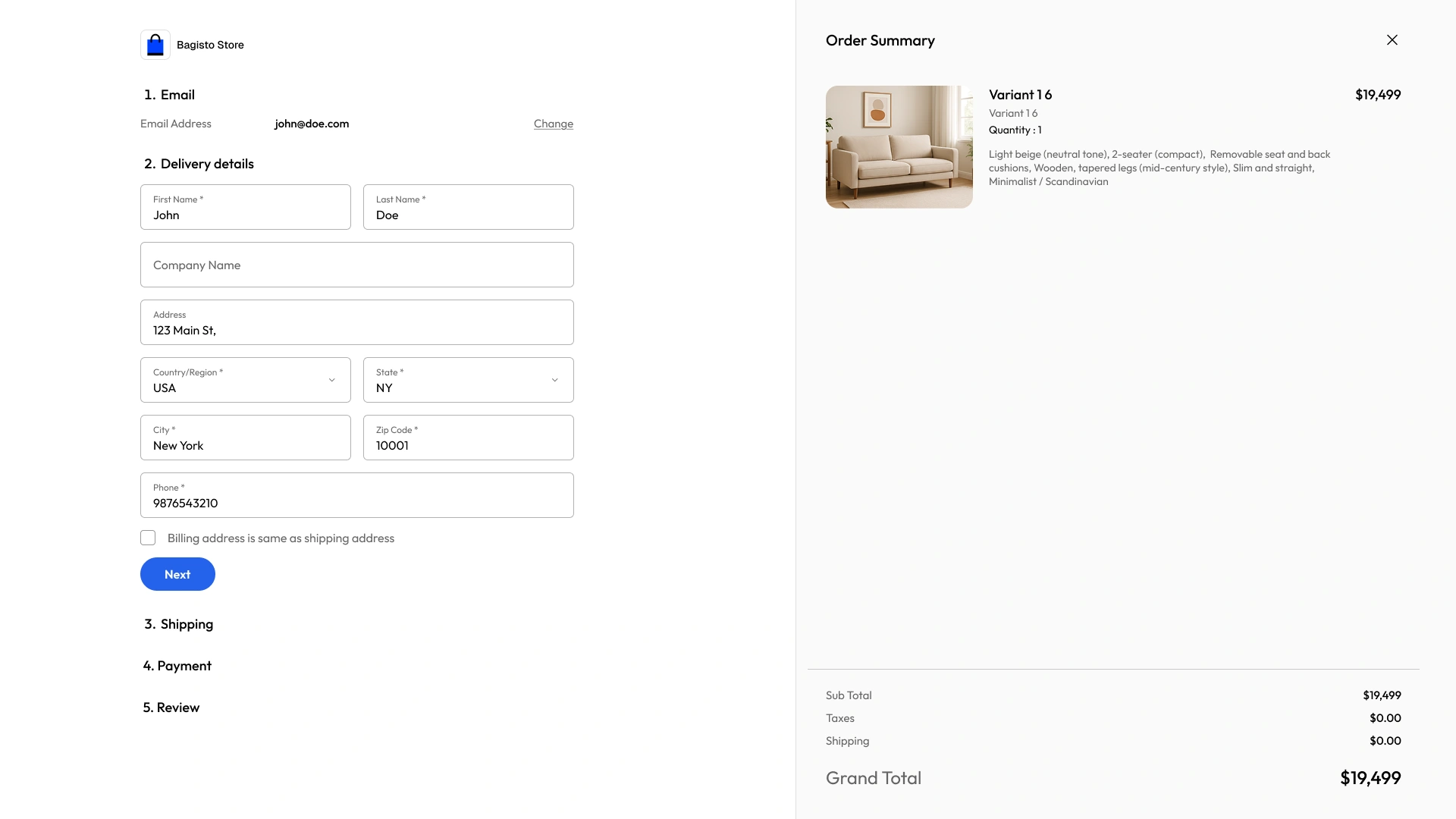
Streamlined checkout into an auto-advancing 4-step accordion with browser autofill, inline address validation, and instant guest checkout options.
Helping Shoppers Find & Pick the Right Product Confidently
A great product page has one job: give the customer complete confidence to decide. I streamlined search and variant selection to remove confusion and second-guessing.
Smart Variant Matrix (No Reset Headaches)
Selecting a new color swatch on a product often wiped selected sizes or gave confusing "Out of Stock" alerts without explaining which combinations exist.
Designed an interactive variant selector that preserves the user's active choices and clearly shows available size and color combinations in real time.
Product Listing Quality (PLQ) Ranking
Incomplete product specifications and inconsistent imagery caused decision paralysis and low buyer confidence.
Structured a 100-point listing quality score that ranks products with complete technical specs, high-res photos, and fast dispatch track records higher in search results.
Instant Faceted Filters & Search
Full page reloads during filter changes slowed down discovery and caused users to lose scroll position.
Engineered sub-second debounced faceted filtering with persistent URL state and typo-tolerant search suggestions.
Building Trust After Payment with Transparent Order & Return Tracking
E-commerce doesn't end at payment. True brand loyalty is built post-purchase by keeping customers informed, respected, and in complete control of their orders and refunds.
Clear 6-Stage Return & Refund Tracker
Customers felt anxious during product returns because they lacked visibility into courier pickup, warehouse inspection milestones, or refund processing dates.
Designed a step-by-step progress visualizer tracking Return Requested → Pickup Scheduled → Product Received → Inspection Complete → Refund Credited to Bank.
Headless PWA Offline Resilience & State Preservation
Brief network drops while commuting caused lost cart items and broken navigation screens.
Integrated PWA service worker caching with ambient offline banners that preserve the customer's active cart and recent browsing history.
Unified Customer Account Workspace
Scattered customer navigation made it frustrating to locate past invoices, manage digital downloads, or repeat previous orders.
Consolidated a clean customer hub with 1-tap reordering, digital asset download keys, and saved payment/address management.
Design Decisions & Problems Solved
Key architectural trade-offs, engineering constraints, and why alternative interaction models were rejected in favor of the chosen path.
Payment Limbo & Money-Deducted Recovery System
When a bank deducts money but the connection drops before confirmation, shoppers panic and fear their funds were lost or that they need to pay twice.
Standard Practice (Friction Point)
When a bank deducts money but the connection drops before confirmation, shoppers panic and fear their funds were lost or that they need to pay twice.
Engineered an automatic "Payment Reconciling" status with an explicit reassurance banner: "Your money is safe — we are confirming your order with the bank or issuing an automatic refund within 15 minutes."
Chosen interaction model engineered to remove user friction.
Strategic Trade-off: Prioritized long-term user clarity and trust over conventional shortcuts, ensuring transparent feedback throughout the flow.
Conversion Impact & Market Metrics
Customer-centric design strategy prioritizing visual clarity, intuitive navigation, and effortless account management.
Key Strategic Differentiator
“Frictionless shopping flows, side-by-side product comparison tables, and a unified customer dashboard workspace.”
98/100
Usability Score
< 1.0s
Page Speed
4 Steps
Express Checkout
+35%
Conversion Lift
Design System & Token Architecture
A scalable, component-driven design system crafted for high visual clarity, dark theme support, and responsive touch targets.
Brand Coral (Primary)
tw: brand-*
Neutral Zinc (Surfaces)
tw: zinc-*
Success Emerald
tw: emerald-*
Warning Amber
tw: amber-*
Info Sky
tw: sky-*
Red 500
4.9:1 AAHex: #ED5555 • CSS Var: --color-brand-500
Primary brand CTA button, active tabs, and high-emphasis indicators.
User Interface Design
High-fidelity storefront screens engineered for rapid product discovery, intuitive checkout, and centralized account management.
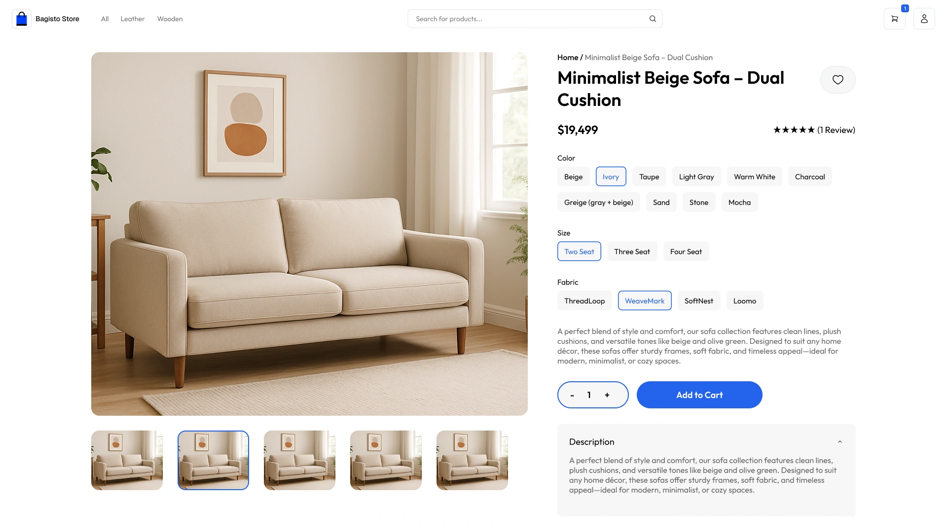
Product Detail Page & Variant Swatches
High-resolution product gallery with clear stock status indicators, interactive variant swatches, and instant add-to-cart feedback.
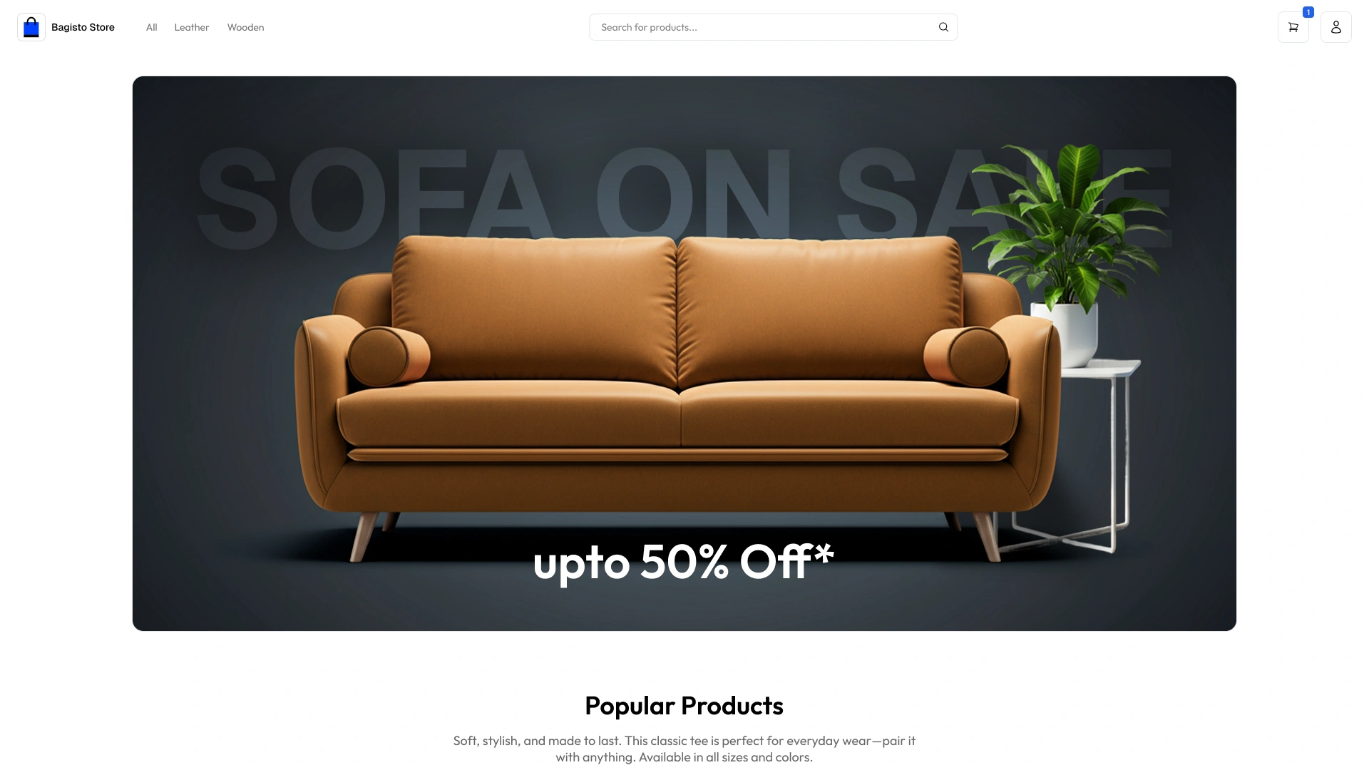
Storefront Homepage Layout
Clean, modern storefront featuring dynamic promotional banners, fast category carousels, and scannable product cards.
Dark Mode Storefront Layout
High-contrast dark mode storefront design engineered for enhanced visual comfort during nighttime browsing.

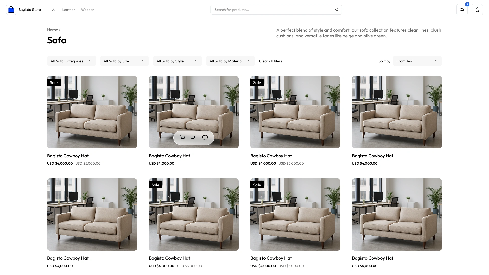
Category Catalog & Faceted Filters
Multi-attribute faceted filter sidebar supporting intuitive price range sliders, brand selectors, and responsive grid layouts.
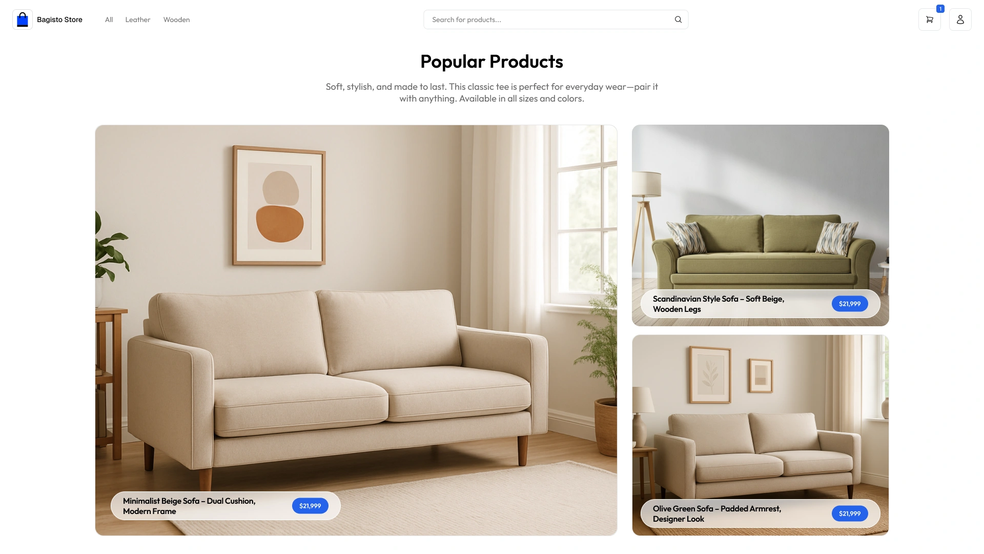
Popular Products Showcase Grid
Curated product grid highlighting trending items with customer rating badges and quick wishlist triggers.
4-Step Express Checkout
Progressive checkout accordion with address selection, shipping options, and secure payment placement.
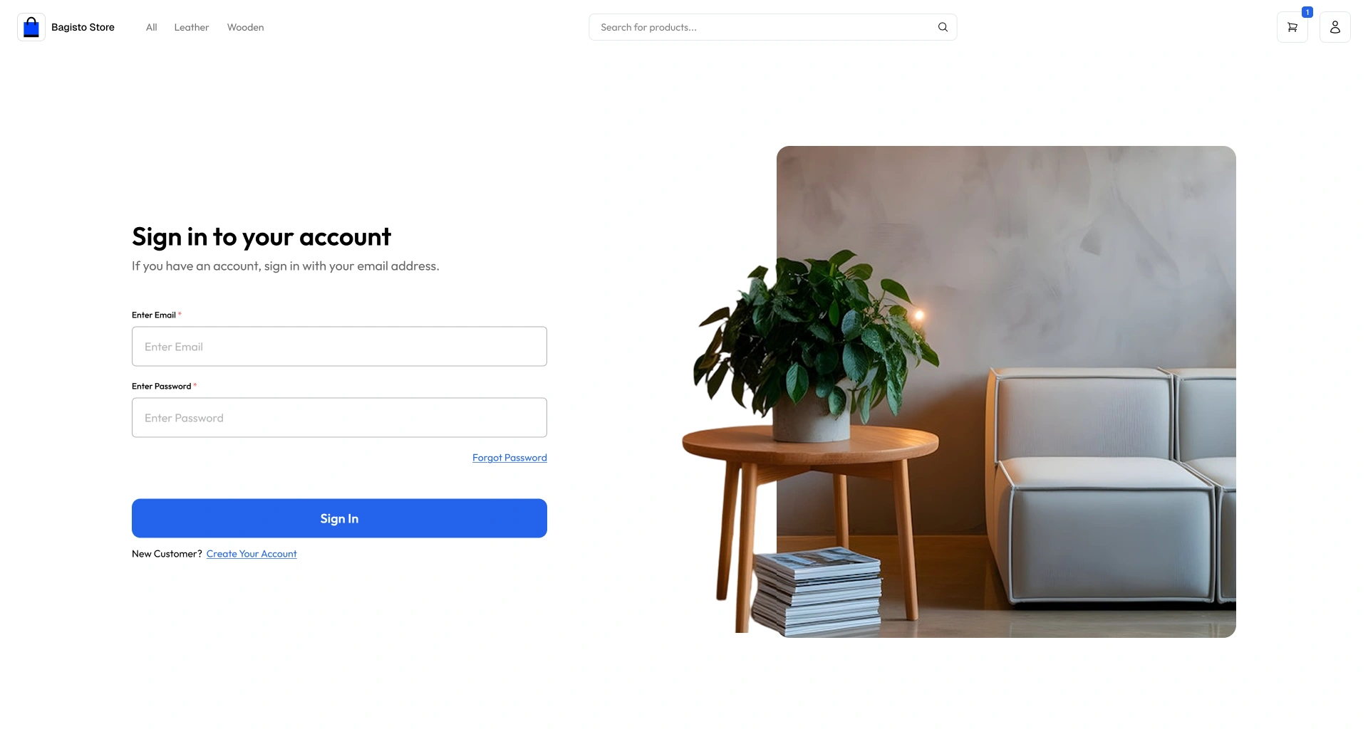
Customer Sign-In & Auth Gateway
Clean authentication portal supporting social sign-in, saved credentials, and rapid account recovery.
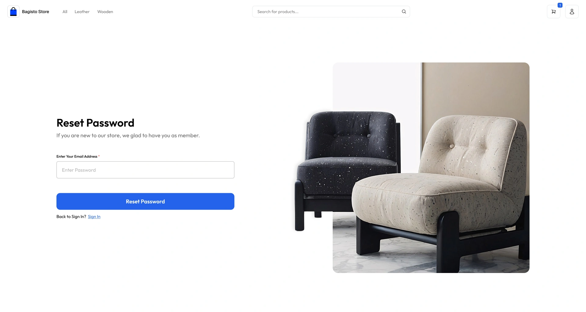
Password Recovery Flow
Frictionless password reset screen with clear verification steps and instant visual guidance.
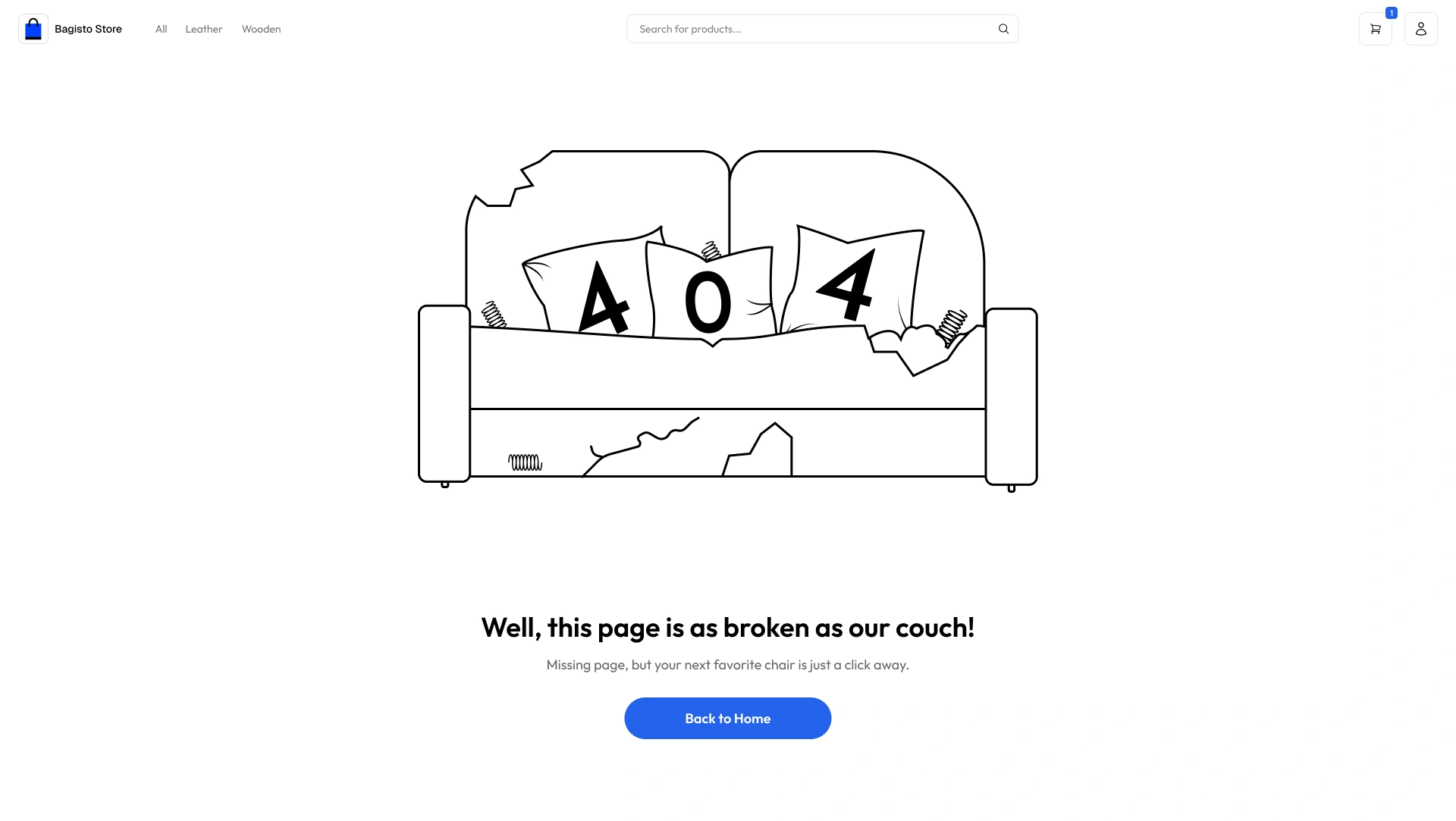
Custom 404 Error Guidance Page
User-friendly 404 error page providing direct search suggestions and quick navigation links back to active categories.
Mobile Application Interface Screens
High-fidelity mobile app interfaces engineered for responsive touch controls, micro-interactions, and accessible visual hierarchy.
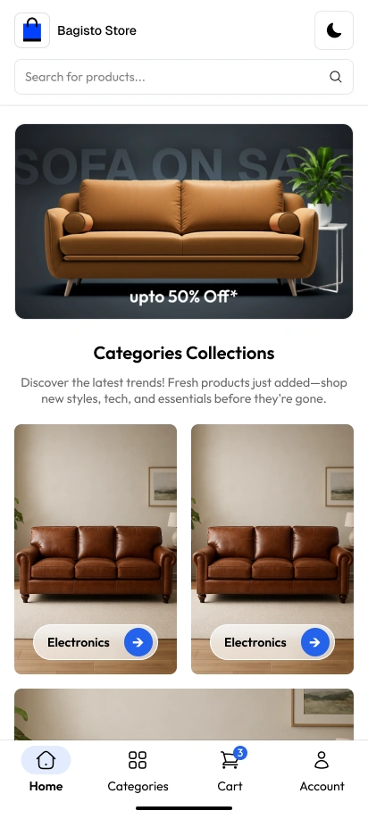
Mobile Homepage
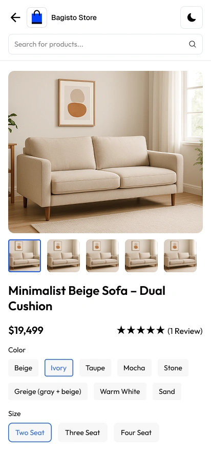
Product Detail View
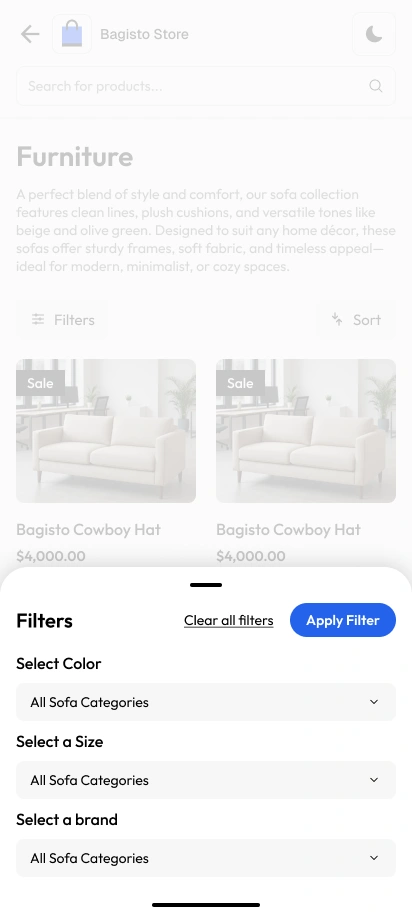
Category Filters
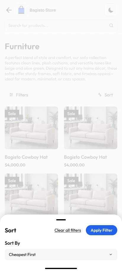
Category Sorting
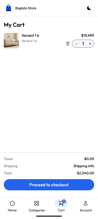
Instant Cart Drawer
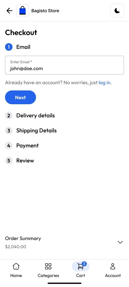
Express Checkout
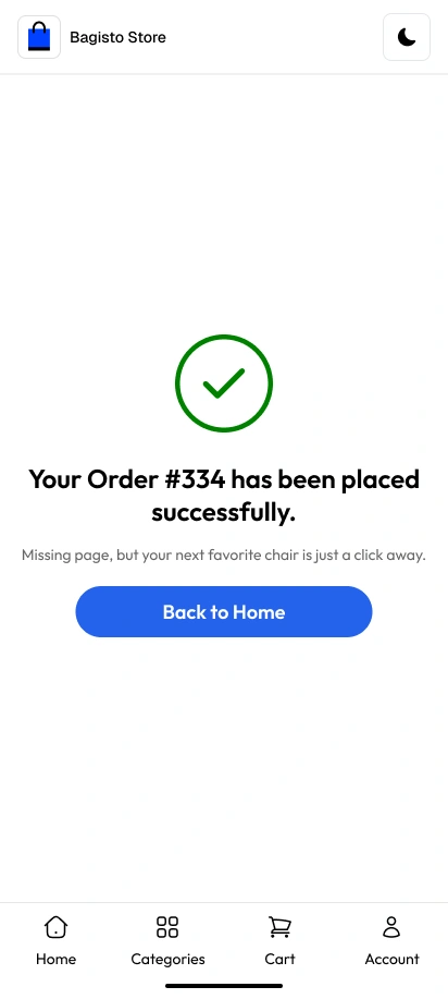
Order Success Confirmation
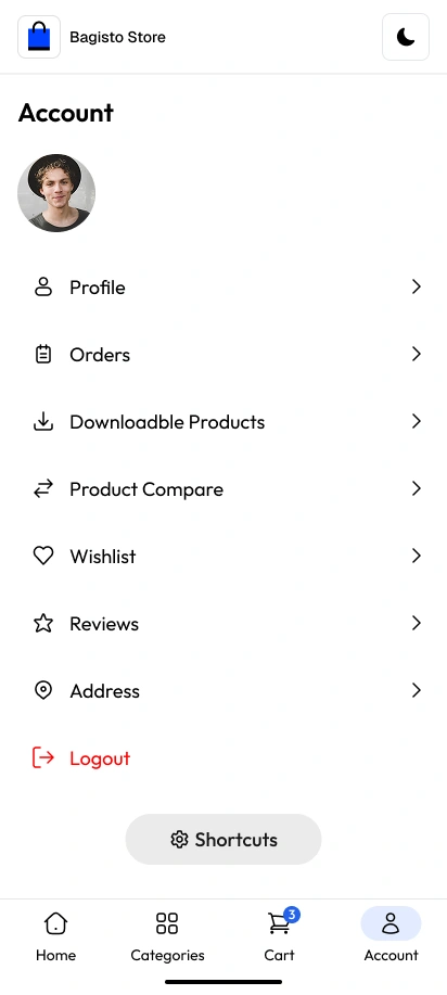
Customer Account Hub
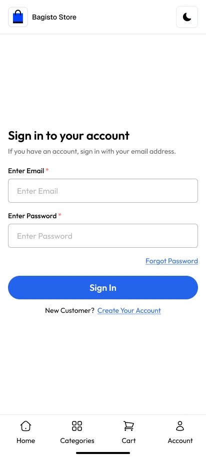
Mobile Login Portal
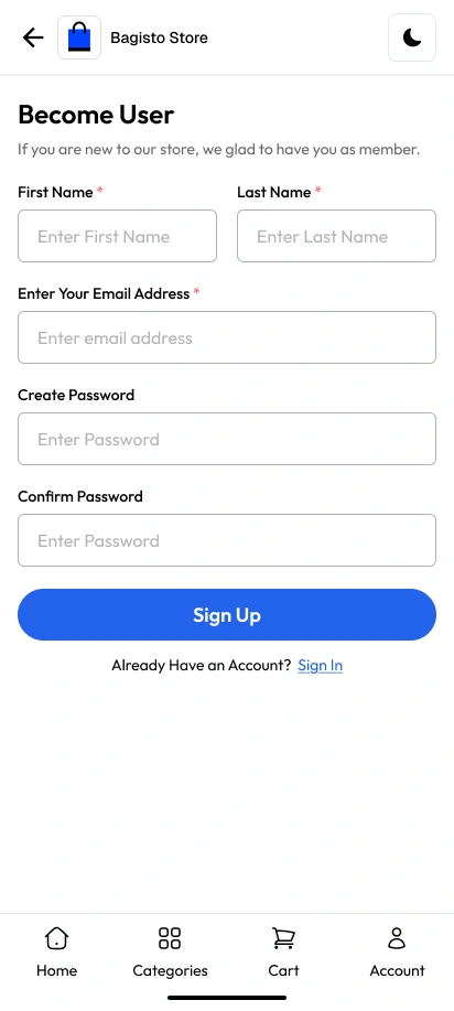
Mobile Sign-Up Flow
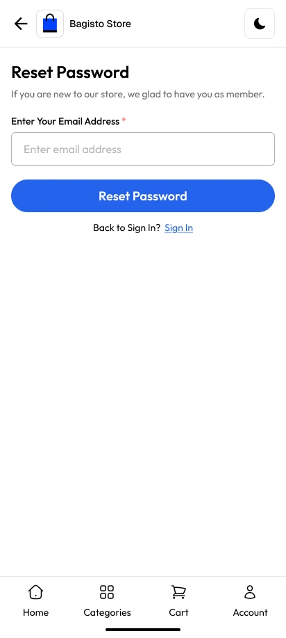
Password Reset
Other Case Studies
Discover inspiring UI/UX and web design projects that showcase practical, modern solutions.
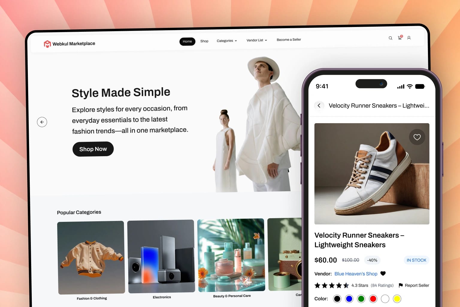
B2C Marketplace
Designed a scalable B2C marketplace with seller dashboards and intuitive checkout flows.
Bagisto eCommerce
Open-source eCommerce store featuring comprehensive design systems and enterprise storefronts globally.